Ever wonder where the Pantone “color of the year” comes from? Who makes that decision as to what color we are supposed to be wearing if we want to be “in style”? I’d love to sit down at that table while the big “color people” are hashing out their decision over bagels and mimosas! They probably start the meeting talking about what they did last weekend and where they were on vacation last month. “The sand at St. Tropez was amazing!” “Hey, these Mimosas are fantastic!” “Can you pass the blueberry jam?” etc. etc.
The “new color” usually is announced in early December. All the fashion industry and anyone who has anything to do with textiles, anxiously sits on the edge of their seats just waiting to jump on the wagon and produce the product that the “in crowd” will be salivating over in the coming year – using that Pantone color that no one can resist!
Who is Pantone? Why do they get the right to choose for the world what is popular and what is not?
Pantone began in New Jersey in the 1950s as the commercial printing company of brothers Mervin and Jesse Levine, M & J Levine Advertising. In 1956, its founders, both advertising executives, hired Lawrence Herbert as a part time employee. Recently graduated from Hofstra University, Lawrence used his chemistry knowledge to systematize and simplify the company’s stock of pigments and production of colored inks. By 1962 Lawrence was running the ink and printing division at a profit, while the commercial-display division was US$50,000 in debt; he subsequently purchased the company’s technological assets from the Levine Brothers for US$50,000 (equivalent to $430,000 in 2020) and renamed them “Pantone”.
The company’s primary products include the Pantone Guides, which consist of a large number of small (approximately 6×2 inches or 15×5 cm) thin cardboard sheets, printed on one side with a series of related color swatches and then bound into a small “fan deck”. For instance, a particular “page” might contain a number of yellows of varying tints.
Basically, Pantone has created a system that is largely a standardized color reproduction system, and as of 2019 it has 2161 colors. They call it a “color matching system”. By standardizing the colors, different manufacturers in different locations can all refer to the Pantone system to make sure colors match without direct contact with one another. The “Pantone Color Institute” created the CMYK process. This is a method of printing color by using four inks—cyan, magenta, yellow, and black. A majority of the world’s printed material is produced using the CMYK process. In 2001, Pantone began providing translations of their existing system with screen-based colors. Screen-based colors use the RGB color model – red, green, blue – system to create various colors. I could go on about the PMS colors, or the GOE system Pantone introduced in 2007, or the new colors added to the CMYK process – making it now the CMYKOG process; but I digress.
So when did all this turn into a “color of the year” game? In the year 2000, the Pantone Color Institute declared a particular color “Color of the Year”.
I’m not really sure why, but they did. 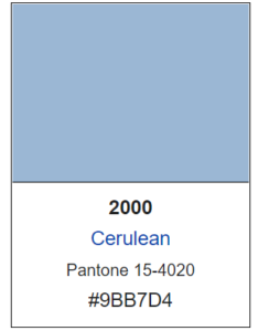
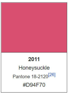
Now twice a year the company hosts, in a European capital, a secret meeting of representatives from various nations’ color standards groups. After two days of presentations and debate, they choose a color for the following year. For example, the press release declaring Honeysuckle the color of 2011 said “In times of stress, we need something to lift our spirits. Honeysuckle is a captivating, stimulating color that gets the adrenaline going – perfect to ward off the blues.”
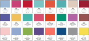
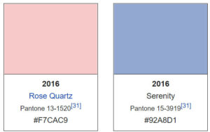
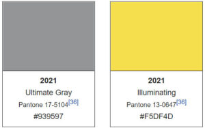
The results of the meeting are published in Pantone View, which fashion designers, florists, and many other consumer-oriented companies purchase to help guide their designs and planning for future products. In 2016 and 2021, Pantone chose two colors for Color of the Year.
Taking a look back since the Pantone “color of the year” was first declared, I thought it would be fun to design some quilts for each of the years in the color that was deemed the “cat’s meow”! I made a short video for you to enjoy – just click on the link below and take a walk through the last 2 decades of color!